The Museum Blog
Category: Art
Out of This World
A Gallery 6 art exhibition preview
 Fanciful Out of This World art exhibition debuts at Children’s Museum of NH’s Gallery 6
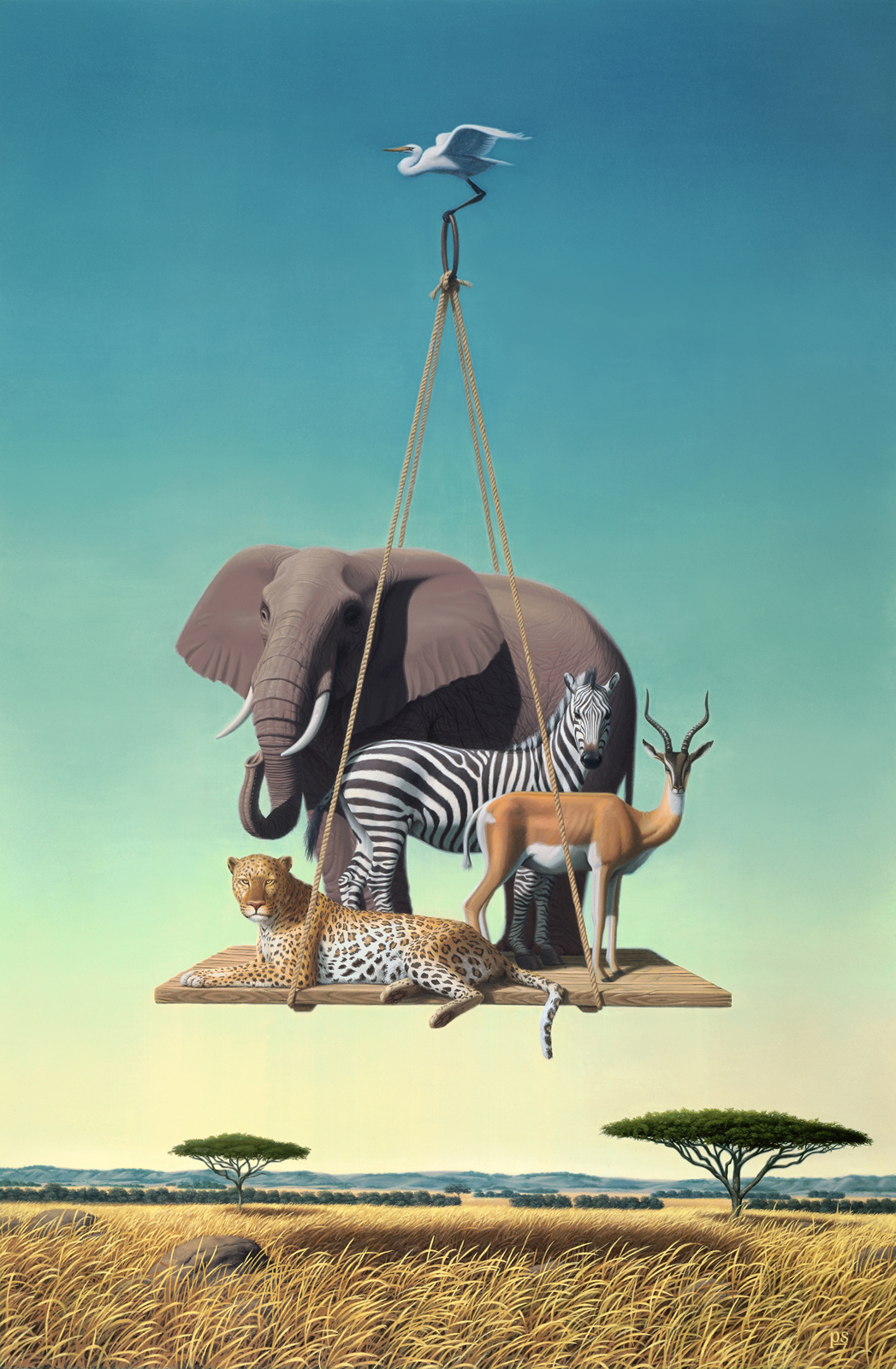
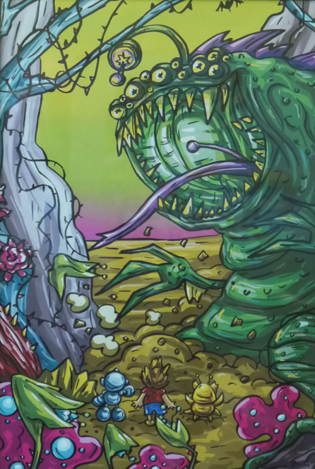
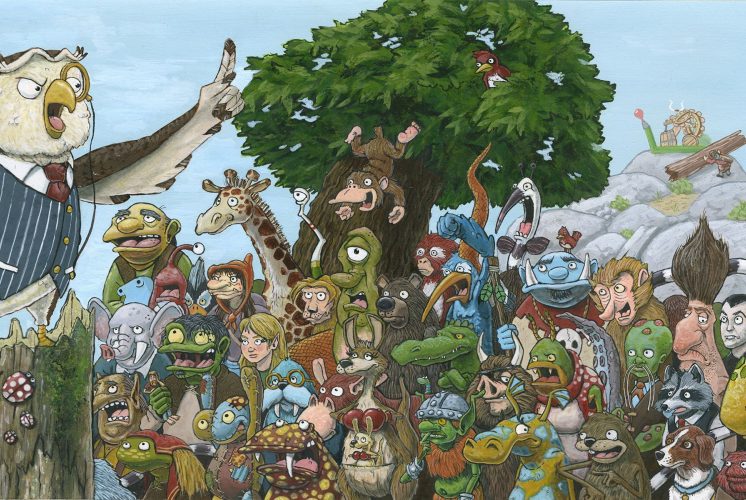
This winter, the walls of Gallery 6 at the Children’s Museum of NH will take the magical and fantastic impossibilities of our imaginations and present them in a way that is real and believable. Out of This World, on view December 3, 2015 through March 1, 2016, contains fanciful creatures in playful and whimsical settings and promises to take viewers on journeys to strange worlds.
Out of This World shines a spotlight on Fantasy art and invites the viewer to suspend disbelief just long enough to view a new realm of possibilities, unhindered by our own expectations. “Believing the ‘impossible’ comes very naturally to children, so this Fantasy theme is a perfect fit for an art exhibition within a Children’s Museum,” shared Tess Feltes, Gallery 6 Curator.
Also on view on the exterior of the Museum is an installation by local artist Sam Paolini. “Sam’s art is all about other worldly creatures existing in fantastic and colorful environments, so we wanted to have her art greet guests as a way of saying, ‘Hey, anything is possible here!’” said Exhibits Director Mark Cuddy. The Gallery 6 art exhibitions are supported by Optima Bank and Trust, the NH State Council on the Arts and the Fuller Foundation.
Close to forty works of art have been selected for the Out of This World exhibition, ranging from anthropomorphized forms to detailed illustrations. These paintings, prints and mixed media pieces are mostly available for purchase and a portion of the proceeds goes directly to supporting the programs at the Children’s Museum of New Hampshire.
Featured artists in this show include: Bill Baber, Cori Caputo, Brian Cartier, Victoria Elbroch, Wolfgang Ertl, Tina Fazio, Marina Forbes, Theresa LeBreque, Fleur Palau, Sam Paolini, Sue Pretty, Phillip Singer, Beth Wittenberg and Shi Yue. The public are invited to join the artists at an opening reception, generously sponsored by Optima Bank and Trust, on Thursday, December 3 from 5:30-7pm.
Out of This World can be viewed in Gallery 6 during regular business hours at the Children’s Museum of New Hampshire: Tuesday – Saturday 10am-5pm and Sunday noon-5pm. No admission fee is required to view the gallery only. Regular admission applies for families who wish to also explore the rest of the museum.
Gallery 6: Flight
Artist Interviews
By Taylore Kelly
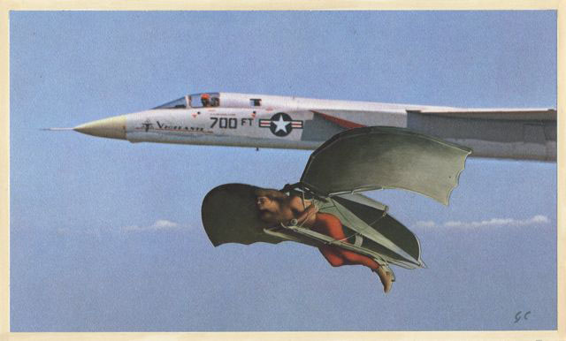 GORDON CARLISLE
Q. Your work felt very nostalgic and dream like. The collage and acrylic medium really worked well together to form a united story. Does creating your work come easy to you?
A. I've been making collages since about 1973, the same year I graduated from San Francisco Art Institute. Back then, I was interested in converting these collages into etchings. Soon, I became less and less enchanted with the etching process, and wanted the collages to just exist as themselves.
I've always found the act of creating them very liberating. Initially, I try not to get too much in the way of where they seem to want to go. Then I jump in and help them get there. Creating collages on my own, I don't work with themes. But I've found Tess's (Gallery 6 coordinator) imposing of a theme a worthwhile challenge.
Here, she asked for two or three collages from me. However, the way I work, I like to lay out a couple of dozen at once and see where they take me. Then, it's a process of winnowing out the less effective ones in favor of the better. By the way, I'm often asked if these are made digitally. They're not. I still use old school materials like X-acto blades and spray mount adhesive.
Nearly all my collages include the use of acrylic paint to help blend the collaged elements to each other, so that the scenes become a little more seamless.
The nostalgia comes from my love of older published magazine elements. I collect all these in portfolios marked "Men", "Women," "Women with Appliances," "Animals." etc. Born and raised in the 1950's, these are the type of magazine elements I grew up with as Life, Look and The Saturday Evening Post came to the door. There's a beguiling innocence to the way those magazine models have been posed that speaks of another time. I enjoy juxtaposing this innocence with more contemporary situations.
Does it come easy? Sometimes. It's important to know when to stop. Sometimes there's technical difficulty assembling just a simple collage, what with complex cutting and gluing and pre-planning the sequence of events. And to be honest, after all that, some just don't cut it, and have to be shelved. In the end, I hope to have more successes than failures; at least the 2-3 Tess requested of me.
In my best dreams, I do fly, and it feels as natural as can be, my arms outstretched as I whoosh through rooms in the house, downstairs, out the door and over canyons and river valleys.
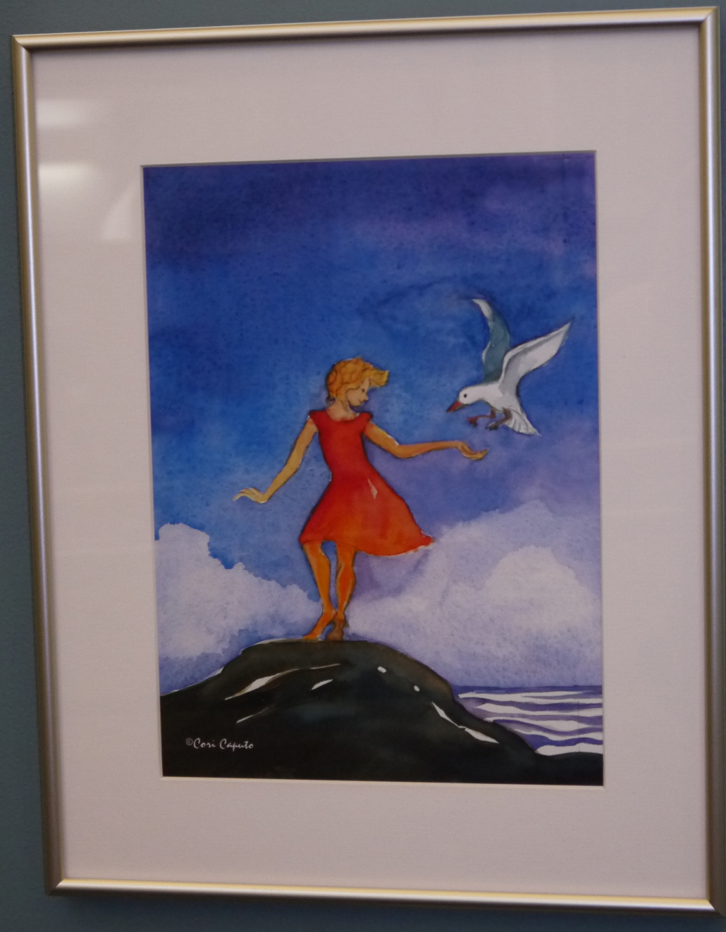 CORI CAPUTO
Q. Your work really seems to have a playful and dreamlike feeling of calm to it. I, as the viewer wanted to dive in and be a part of what was going on in your pieces. What are you trying to communicate with your art?
A. Because there are a variety of themes in the paintings I have in Flight, I would say their messages range from humor, expressing the simple, sheer joy of weightlessness, adventure, independence, escape, searching for answers or a world-view of a situation. However what I ut on the paper and what the viewer discovers about the art can be two different things depending on their mood when they view the work. It could be deemed as ridiculously silly or it could motivate them to cast off their old life and start fresh. That is the joy of Art, it can be many different things to many people.
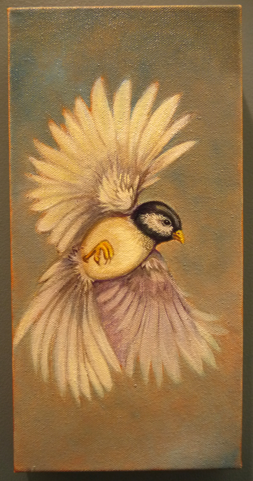 TESS FELTES
Q. Each and every one of your pieces truly feels like the subject manner is a living, breathing animal. They are evocative and moving. What is your relationship with animals?
A. As a shy child growing up on a farm in rural Ohio, I can honestly say my first best friends were animals. Countless hours were spent surrounded by nature, observing and forming life-long bonds. I was always drawing in an attempt to capture and respond to the beauty and mystery of the natural world.
It was when I had the opportunity to learn scientific illustration through the Field Museum of Natural History in Chicago that I was finally given the tools to hone my skills and to more accurately portray my subjects.
This has lead to an interesting and gratifying career creating illustrations for journals and books. Lately, however, my goal is to animate my subjects, concentrating on the illusion of movement. It is a privilege to exhibit these attempts at the Children's Museum.
![]() LARRY ELBROCH
LARRY ELBROCH
Q. What better way to see the world than from a hot air balloon? The imagery looks like layers and layers of other images and seems to tell a story. How has your work influenced your life?
A. I have had several careers, but my photographic work has enriched my life for two reasons. First, traveling to countries like, India, Nepal, Tibet, Myanmar and Bhutan has exposed me to various cultures centered on spirituality. These amazing experiences started my creative journey. Second, meeting these people enhanced my understanding of self. We are more the same than different and we should respect these differences.
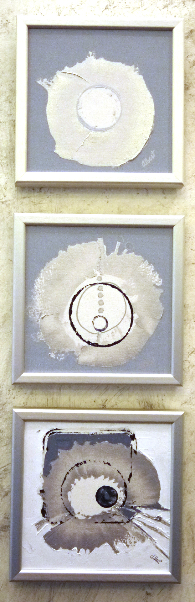
BARBARA ALBERT
Q. This group of work really draws one’s eye in, with its metallic movement and beautiful composition. Did you choose the subject matter first as flying saucers and then create these pieces? What is your creative process?
A. The holographic movement of my circle paintings when lighted comes from silver acrylic paint applied thickly and scraped thin with a palette knife. I experimented with different size canvases and a variety of contrasting backgrounds to suggest environments for these reflective circles. Both the seemingly three dimensional round shapes and the flickering motion suggested flying saucers to me and I was delighted to show them in CMNH's Gallery 6 exhibit about Flight.
 SUE PRETTY
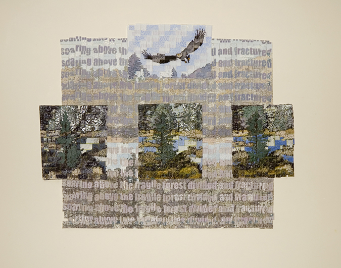
Q. The combination of weaving and painting is such an innovative and beautiful display. This, united with the subject matter was quite breathtaking. How many different mediums do you work in?
A. The piece in the Flight exhibition, Soaring above the Fractured Landscape is a combination of digital images. The photo was manipulated in Photoshop: two variations of the image with a layer of text against the background. The images were then printed, cut apart and re-woven. I then glued these down and highlighted with gouache. I have 2 separate images: the background and the three trees in the foreground and an eagle, each with variations. I like the fact the reassembled image tends to not always perfectly align. This enhances the fracturing of the landscape concept.
My paper weavings are like sketches. Tapestry is a very slow process, which means I can work through images and thoughts with these. The different media feed each other. I think it is important to experiment to open new avenues of exploration. I have done quite a few paper weavings. I work on multiple drawings and paintings before starting a tapestry.
In general I work in tapestry, digital, multimedia, painting, beads, dying, photographs and sculpture. I have worked in oils, encaustic and quilting. I think it is all part of a whole – creative play.
 KATE HIGLEY
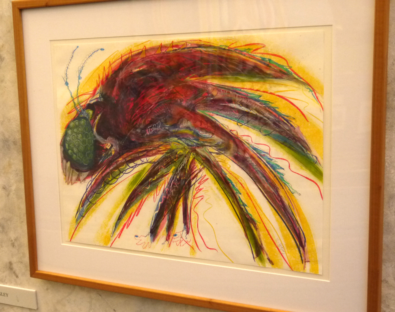
Q. The pieces in this show have a lot of energy and seemed to have method of free-rein motion. The imaginary insects have an amazing frenetic energy that resembles real life, this combined with the colors and how the medium was used is quite spirited. Which is more important to you, the subject of your painting, or the way it is executed?
A. The subject of these works was part and parcel of how they were executed. They are actually monotypes, one-of-a-kind prints with the addition of acrylic paint and pastel. I began the print with the teeth several years ago and had it stored in a flat file. Every few months I would take a look at it and wonder what to do next. When the theme of the exhibition was announced, I knew it was time to finish the work. The initial energy was still there and I began to make silly details like the teeth, the feet and colored toenails. When it was completed, I knew I needed a companion. Initially, I began with something quite different, but when it was well started, I knew it was too static. I started over and copied the basic body shape of the first insect but with more vibrant colors. The proboscis was the final bit because I wanted a conversation between these two critters and it certainly seemed that he might not be able to fly with that appendage. So, the subject informs the execution. I love insects and in the past have done some highly realistic drawings of insects while viewing them through a microscope. A field zoology class in graduate school at Wesleyan introduced me to insects and the myriad ways they are assembled. These two pieces are purely imaginative, while knowing that insects often have "hairy" bodies and appendages like a proboscis. They certainly don't have toenails.
SUSAN SCHWAKE
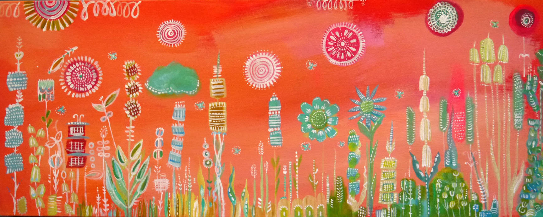
Q. The pieces in Flight seem to almost tell a story. They also remind me of what music would look like if it were painted: a beautiful collaboration of birds, insects and flowers. Who and what are your influences?
A. My three paintings in the exhibit were painted in late winter when my thoughts turn to summer. They came on the heels of a February/March visit to my husband's parent’s home in Germany where spring comes at that time. They live in a tiny village surrounded by farm and woodlands and we do a lot of biking around the woods. My love of everything nature and working with children are my greatest influences. Nature never disappoints me and the freedom children have with art inspires me.
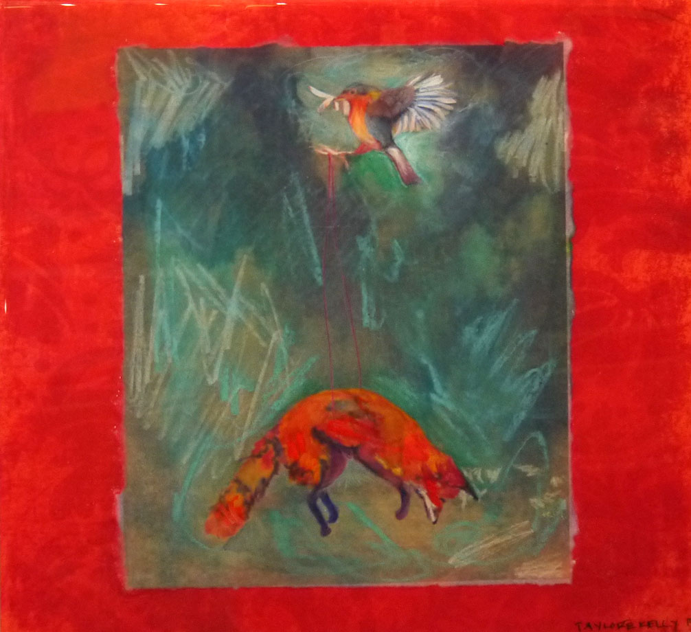 TAYLORE KELLY
Q. Your pieces, as well as the titles, are very poetic and dream-like. Did you create the two pieces specifically around the theme of Flight, and do you name your pieces before or after they¹ve been created?
A. Any gallery exhibition I am asked to be in I always create the work specifically for that individual show. I never use pre-existing work. I feel like I am cheating if I do that and am selling myself and the "soon to be born" work short. There is a lot of art wanting to be born and waiting to be created. That's why I am an artist, so any opportunity I have, I cowgirl up and create. It's an amazing way to be and I am quite fortunate to be attuned and wired this way. It's the same with commissions. I would never give someone something I had already done, I want my work to feel special and the person who has it to know it was specifically made for them, or the show. It feels important and vital to constantly make new art and not just back log and recycle my work and I am lucky and fortunate enough that most of my work is bought and goes to new homes. That's the point.
As for naming of pieces, I wait until I am done with the piece and ask it what it's name is. I sit down quietly with the piece and just start writing the words I see in my mind, after asking, and thus the title. It's really like creating beings for me. I don't know how to do it any other way. It's like giving life and with that comes responsibility and care. When it comes down to it, I just care a lot. I want that to show in everything I do, including my art.
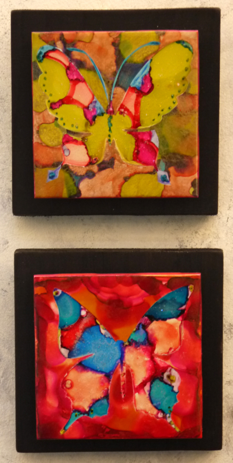 NEVA COLE
Q. The natural world imagery is peppered throughout your work, and is quite eye-catching in its jeweled, vibrant colors and almost musical feel. Like one can "feel" your work, sometimes musically, sometimes with it's breathing….What kind of creative patterns, routines or rituals do you have when creating?
A. I work in a lot of different mediums and each medium seems to have it’s own routines. For the tile/alcohol ink pieces (the butterflies and birds), that series started with a lot of free experimentation with a fun new media. I stumbled upon a reference to alcohol inks online and after purchasing some, just played with it for about a year, off and on. I tried it on glass votives, textured tile, old porcelain plates from Goodwill, and then finally on the bright white bathroom tiles. Initially I wasn’t trying to make any kind of recognizable shapes. I just liked the way the paint interacted with itself. There weren't any patterns, which I love. I like the randomness. But inevitably, after the chaotic randomness is created, whether it’s with the alcohol inks or with the painted paper I use to make my paper collages, I always end up going back to very ordered and precise work to tie it together. For instance, with the tile pieces, I end up taking things a step further and adding and subtracting the ink until I’m left with some kind of animal form, be it butterfly, bird, octopus, etc. With the paper collage, I use a very precise routine involving tracing paper, exacto knives and ink. I actually enjoy using ink on the very edges of the paper to create the illusion that the piece is a painting or drawing, and not a collage of many hundreds of pieces of paper. For me, the combination of chaos or experimentation and precision and detail is really satisfying.
"Of Beauty and Beasts" Illustrator Interviews
 The illustrators from the summer 2015 Gallery 6 exhibition "Of Beauties and Beasts" answered some of our questions about their style of illustrating, from where they get their inspiration and more! The exhibit is on view in the Children's Museum of New Hampshire through Sunday, September 6.
Rebecca Emberley
Q. Your beasts from Ten Little Beasties are such great combinations of fangs and fur. Did the process of collage allow for some fun experimenting when creating these creatures?
A. Collage is a very forgiving art form and allows for lots of experimentation in any genre, but beasts are particularly fun! There are no limits to fangs, scales and horns!
 Karel Hayes
Q. In what way have your own favorite childhood books influenced you art today?
A. One of my favorite books from my childhood was a 1932 edition of Robert Lewis Stevenson's A Child's Garden of Verses. I found it in a second hand bookstore when I was about ten years old. Second hand bookstores were favorite places for my family to visit. I was first attracted to the book by the wonderful watercolors by Juanita C. Bennett. She was not as well-known as Jessie Wilcox Smith, but I think her work rivaled that well-know artist.
 Robert Squier
Q. Your illustrations are done in “digital media” but the results look very traditional. What inspired your style of illustration?
A. I'd like to think my illustration style is still evolving! My earliest influences were Marvel comics and MAD magazine. When I started working professionally, I worked as a freelance commercial illustrator; that required me to be a chameleon, adapting my style to many different clients' needs.
When I made the transition to illustrating for children, I concentrated on traditional media like watercolor, acrylics and color pencil. I started working digitally out of necessity. Many of the projects I was working on required speed and flexibility – a digital illustration is easier to edit than an acrylic painting. My earliest digital work looked "computery," but over time I've learned to work in a manner that looks more traditional. I prefer a more traditional look because it allows me to bring in the texture, layers of color, and lively line that I developed during years of working in traditional media. But doing the work digitally allows me to work more quickly and allows for easier editing.
For most pieces, my process includes both digital and traditional techniques. For example, I might do a pencil sketch, scan it, tweak it on the computer, print it out, add shading and texture to the printout using an ink wash, scan it again, and then add color and additional texture on the computer.
 Emily Drouin
Q. Your art features some truly terrifying “Beasts.” Where do you get inspiration for these monsters?
A: Ever since I was a child, I've had a passion for illustration and storytelling, and love drawing monsters and robots! I am inspired by those countless trips to the library as a child, such books by Roald Dahl, Maurice Sendak, Chris Van Allsburg, Lewis Carroll, comics such as Calvin & Hobbes, Peanuts, Disney Adventures, and from Jim Henson movies and shows like Star Trek, Invader Zim, Futurama, Dr Who, Farscape and Stargate.
David McPhail
Q. Your two styles of illustrating, pen and ink and acrylics, are very different from each other. Do you find that one lends itself better to portraying “beauty” or “beasts”?
A. Nearly ALL of my books were done in pen and ink, and watercolor. A few are PENCIL and watercolor. Every few years, I feel the urge to "paint," to stand at an easel and apply gobs of paint to a canvas or board. Often, this desire to paint, coincides with a book illustration project that lends itself nicely to the medium. Edward and The Pirates, for example or Farm Boy's Year. When this "convergence" happens I get out my box of acrylics and I prepare some boards with a mix of white gesso, and Burnt Umber paint. I don't like to paint on a WHITE surface. It is much too stark for me. I prefer to paint on a mid-range tone, that way I can make SOME things darker and then bring the "lights" forward. When all is ready, I begin.
Unfortunately, a three or four year gap between "painting" projects, leaves me rusty, and unsure so it takes a while to get up to speed. Sometimes, by the time the book is finished, I feel that I'm just beginning to get the hang of it! But deadlines must be met! Of the nearly 200 books that I have illustrated, fewer than ten were done with "paint."
Yong Chen
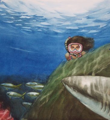
Q. Most of your illustrations in the exhibit seem to focus on the “beauty” around us such as family, tradition, friends and even the underwater scene with the sinister looking shark is beautiful! Are there unexpected challenges when it comes to creating scenes of beauty?
A. Thank you for seeing my art in such perspective. Actually my goal of making art for children is to build connections of love, respect, curiosity and understanding between different cultures, and in large, between each individual person - us. I admit, I appreciate all the beauty around us, and perhaps that's why I naturally express how I see them in my paintings, but that is not the reason I make art. For example, the book Swimming with Sharks came to me when I didn’t understand much about sharks. After I read the manuscript, I upgraded my understanding of the universe, and how much we rely on the balance and health of the earth. I turned to passion to express my new ideal. Because I was afraid of sharks as I grew up, then I turned to respect the shark as an equal member of our living environment as a beautiful creature. When I worked on the illustrations for this project, I related these mixed feelings as I tried to communicate with my audience. If I just to create scenes of beauty, I may not have problems. But the trick is how to use beauty to educate my audience with messages so that they will accept, and that is not an easy task.
 Teri Weidner
Q. For people who have never tried to illustrate a children’s book, it might seem like a simple process. But your work goes through many edits and alterations before being finalized. Do you ever find that the process is tiring or is it all a challenge you’ve come to embrace?
A. I think illustrating a picture book is a sort of marathon. It can be a long, difficult process drawing 32 pages, but the format offers an amazing opportunity to tell a visual story. I start all my books knowing that the first round of sketches will probably change dramatically by the time I start the final color artwork. I really enjoy the process of reworking and refining the imagery. Most of my books go through at least 5 rounds of sketches, some initiated by me, some initiated by the editor and art director. My experience with publishers has varied dramatically from book to book. I've had some publishers that gave me almost no feedback beyond "This looks great!", even when I knew my drawings were still far from adequate. In those cases, I've continued to work on improving the sketches on my own, until I was also happy with the results. My favorite way to work, though, is with editors and art directors who can help me hone the imagery, and who offer up creative and clever ways to improve my sketches and make the book stronger. Occasionally I don't agree with their comments (which can be frustrating) but after a day or two of stewing I can usually begin to see where they're coming from and use their ideas as a spring board to improve the illustrations. Even with criticism I think is way off base can be helpful, because it forces me to define which direction the visual story is going, and defend my choices. If I can't defend them, then the pictures really do need to be reworked! So yes, sometimes the editing process can be tiring, but over the years it's something I've come to embrace. If it leads to a better book, it's worth all the effort!
Sean Bixby
Q. You have such a fun variety of creatures in your illustrations from The Uncrossable Canyon books. I imagine your sketchbook as being filled with drawing experiments. Is the planning/sketching phase the most fun for you or do you prefer working on the final illustration?
A. The planning and sketching phase are really fun to me. For The Uncrossable Canyon series, the author had many fantastic characters written into the story who were fun to design. There were also many other characters that I was able to create myself. There is a lot of brainstorming and experimenting in the process of coming up with characters. For crowd scenes I filled them with some of my favorite animals, including my dog, my favorite monsters and dinosaurs. I even looked at sketchbooks from when I was young and redesigned some of the characters I had created years ago. I have to focus a lot during this phase as I am constantly drawing and revising the characters and also the layout of the final illustration. It’s once I have the drawing down on the final paper that I can start to relax a bit more. When I start to paint, my mind is a little more free and I can listen to music, movies or podcast. So with all this said I would say have no preference as each part of the process is unique and challenging in its own way.
Ascent or Descent
A Public Art Collaboration
Have you been by the Children’s Museum of New Hampshire recently? There seems to be a group of characters climbing . . . sitting . . . jumping . . . flying? Are they climbing up . . . sideways . . . down? Are they friendly or not so nice? Where did they come from and what are they doing on the front of CMNH?

Ascent or Descent is a collaborative public art project designed by the Children’s Museum of New Hampshire with six Seacoast area artists and craftspeople. This project is designed to make you curious and wonder what it is, exactly, that's happening with these figures upon our facade and what the different stories may be behind each one. We purposefully kept our description of a 'humanoid sculpture' request very broad when potential contributors were contacted. We wanted to show a diverse group of 'people' created in a variety of styles using a multitude of materials.

David Masse is a local blacksmith living on the southeastern coast of Maine who used this opportunity to design and construct something different than he would typically.

Masse decided to create a superhero and shaped it by using forged steel. He then added a fabric cape that blows in the wind. What do you think this superhero's codename is? What are his powers and how did he get them? What if he (or she!) isn't a hero . . . but a villain?!

You can check out more of David Masse's work on his website.
Rick Burns, a sculptor working based in Berwick, ME, describes his work as "creating Industrial Symbolic Abstractions using metal, wood, clay and mixed media".
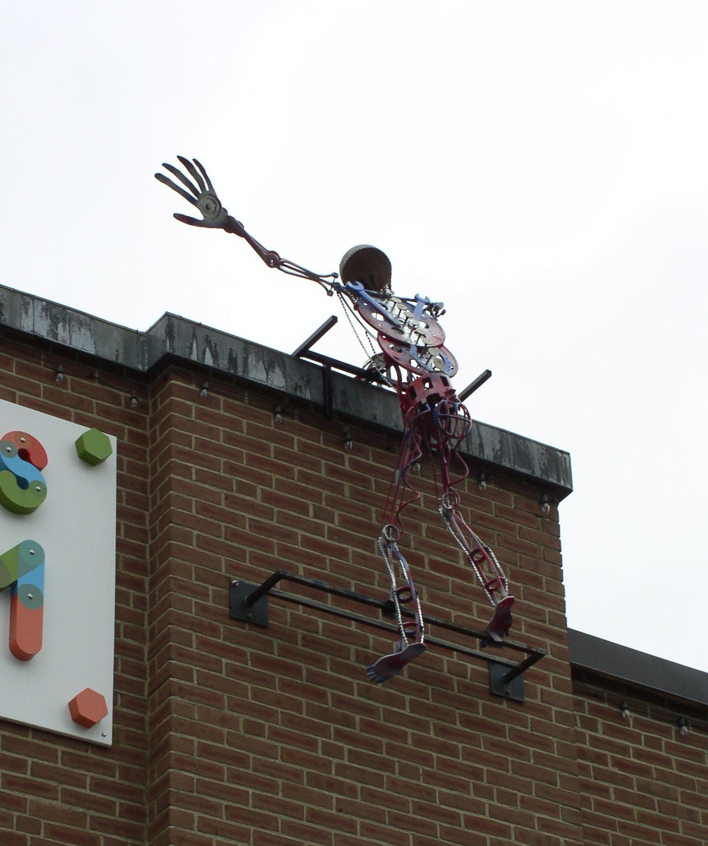
If you look closely at his sculpture, you can discover some hidden objects! Do you see the wrenches that make up the arms between the elbow and the wrist?

What about the gears inside the chest? Do the gears help this character move? Does he have to be wound up like a toy? And, of course, you can't possibly miss the incredibly cool medieval helmet with pieces of chain mail. This "humanoid sculpture" is ready for anything!
You can find more creative works of art from Rick Burns at his website.
Adam Pearson is a New Hampshire based sculptor and craftsman. His child-sized figure is jumping . . . or is he flying . . . off the roof of the Children's Museum! Is this the first time he's opened up his wings and flown? Is he looking for food . . . or is he playing a game? Is he headed towards the park . . . or higher into the trees?

This sculpture, the highest piece in the installation, was created by Pearson cutting, bending and welding the metal and steel of the green body and the large red tail and swooping wingspan.

More of Adam Pearson's work can be found on his website.
Chris Wright is a local artist and Director at the Port City Makerspace. For Ascent or Descent, Wright designed and created a piece that is fashioned almost entirely from aluminum. This includes the frame, bones, ribs, head, and extremities!

Wright fabricated every piece of the sculpture, including all the individual vertebrae in the articulated spine.

There was a time not too long ago that Nate Walker's Giant Blue Crab sculpture was one of the only pieces of public art in the city of Dover. Now, Wright's piece joins five other pieces of public art looking down at art in several places in Henry Law Park!

Like Chris Wright, Jeff Gunn is also a Director at the Port City Makerspace and a local craftsman. Gunn began with aluminum to create the general form of the body for this robot . . . or is it astronaut . . . or is it robot astronaut?

He then heated and bent PVC boards to create the white outer shell around the aluminum. To design and produce the hands and other smaller parts for this piece, Gunn used some newer technology: a 3D printer!

One of the coolest features of this piece is one that can't be seen from the ground - but its effect can! On the top of right shoulder, Gunn installed a solar panel. The panel is connected to the "eye" bulb of the robot figure. So after a long day of bright sunshine, a cyclopean beam of light emerges as dusk falls. Is he guarding the museum . . . or is he guarding the park? Is he taking a picture with his eye . . . or shooting lasers?
Kali Ann Rocheleau is an artist who enjoys exploring many different mediums, including charcoal, watercolor, sculpture, and cartooning. She lives in Portsmouth with her fiancée and loves to create art whenever she can.

Rocheleau chose to make sculpture with a more whimsical, pencil-sketch like quality. She created this sculpture using bent and twisted pieces wire. One of the coolest part's of this central piece of the installation is that depending on where you're viewing it from, it seems to change shape. From one angle it appears to be a woman, but from another - a man. From the outside you can see its hands and fingers in great detail, while the feet and toes are better viewed from inside. This piece also blends in with the building almost perfectly. Is it because the figure has the ability to turn invisible? Is she made up of water . . . or is it air?

More of Kali Ann Rocheleau's art can be found on her Facebook page.

The amazing . . . or is it magical . . . or is it scientific . . . or is it fantastical figures that make up Ascent or Descent will be visiting the museum and Henry Law Park from June to the end of October 2015. For those interested in previous public art projects by the Children's Museum of New Hampshire, check out our look at Bryan Rutland's abstract art piece that adorned our building through this last winter and spring or at the journey of how artist Nate Walker and the Dover Middle School Art Club designed, created and installed the Octopus Bike Rack in front of CMNH.
- - - Begin Transmission - - -
A Strange Communication Arrived This Morning . . .
When CMNH Staff arrived to work this morning things were definitely . . . different. The exterior facade of our building and our roof had received . . . visitors . . . in the night.
Who are they? Where do they come from? What do they want?
All that was left for us was this video . . .