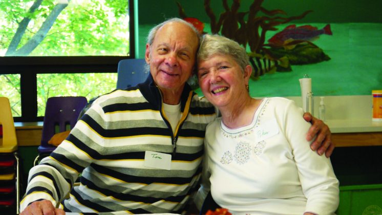
Meet the CMNH Staff: Meredith Lamothe
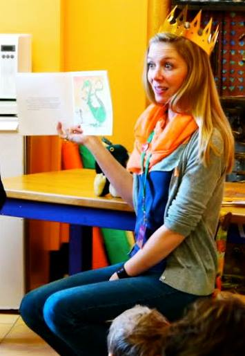 Name: Meredith Lamothe
Title: Lead Educator
How Long at Museum? 3.5 years! I started in May of 2012.
What is the most fun part of your job? I love teaching. I look forward to Thursdays because I get to teach both Junior and Homeschool science classes. I also absolutely love doing Baby Storytime—nothing is a better start to the day than seeing and reading to a bunch of smiling, giggling babies!
What is something that people might not know about you? My bachelors degree is in Theatre Performance. I really enjoy performing and try to be in a couple plays a year.
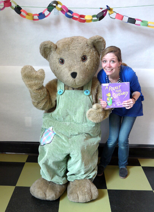
What is your favorite exhibit at CMNH and why? I like the post office. I love the number of different ways that visitors can experience the exhibit and that it facilitates exploration of the rest of the museum.
Alzheimer's Cafe Symposium
Symposium on popular Alzheimer’s Café
Children’s Museum of NH collaborates to share lessons learned
The Children’s Museum of New Hampshire has hosted a free monthly Alzheimer’s Café program for the past four years for families who have a loved one with dementia. With generous support from AARP, the Museum was able to conduct a research project to determine the benefits of attending the Café. The findings will be shared at a free symposium at the Wentworth-Douglass Hospital Conference Center (789 Central Ave) in Dover, NH on Monday, November 16 from 1- 4pm.
A report highlighting the results of the study, done in collaboration with Keene State College’s nursing program, will be available to anyone attending the symposium. “We conducted interviews, observed, and surveyed our Alzheimer Café participants,” says Paula Rais, Vice President of Development and Community Engagement. “All of the data was compiled and revealed the benefits of the Café from the perspective of those who attend. We also learned what improvements we can make to help us plan for the future. It’s been an invaluable process and we’re excited to share the results with the community.”
The Children’s Museum of New Hampshire launched the first Alzheimer’s Café in the Eastern United States in October 2011. It has since attracted widespread attention from families affected by dementia as well as healthcare professionals. In 2012, the Museum’s Alzheimer’s Café program received the Leaders In Innovation award from the New England Museum Association. Held the third Thursday of each month from 2-4pm, people living with Alzheimer’s disease are welcomed, along with their family members and caregivers, to gather in a supportive, non-clinical setting to relax, enjoy refreshments and socialize.
The public and press are welcome to attend the symposium and are asked to RSVP to Paula Rais at paula@childrens-museum.org or by calling 603-742-2002.
FoodWorks: Healthy Holiday Eating
Bring us some figgy pudding!
By Sarah Terry
So it's that time of year again... holiday season is upon us! Personally, Halloween is my favorite holiday, but I'm also a dedicated caroler and mulled cider aficionado, and those are just two of the many reasons I'm excited for the coming winter months. Holidays mean food, family, friends! Food again! And with that in mind, what better time to talk about our Foodworks program? With generous help from Hannaford grocery store, I've been working on a whole slate of upcoming events, including one all about healthy food for the holidays!
Now, healthy eating during the holidays can seem pretty much impossible. I come from a big family that has a habit of making enough food to feed the entire block, and still have enough for leftovers the next day. I mean, I can remember Thanksgivings where we had a turkey, a ham, stuffed shells, and still made mashed potatoes, stuffing, cranberry sauce, the works! And that was before I became vegetarian, so now I always make a vegetarian entree too! I'm surprised our table didn't sag in the middle! Plus, family parties are only the start throw in cookies swaps, and office parties, treats for school... it feels like you're navigating a mine field full of gravy boats and candy canes! But there are actually a lot of small choices you can make that will help you have a healthier holiday (or at least a healthierthan-eating-an-entire-bowl-of-mashed-potatoes holiday, as I may have done once or twice...). One of my favorites? Bring a healthy, delicious dish for everyone to enjoy!
Holiday desserts aren't usually the pinnacle of health food. So many cakes and pies and cookies and candies! You definitely don't have to resist every pie, but you can bring some awesome desserts to your next holiday party that won't make you feel like falling into a food coma after dinner!
For the Healthy Holidays Foodworks program, our dessert of choice is...
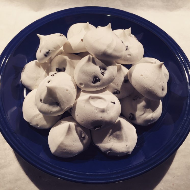
Meringues!
Meringues are tasty, simple, fun, and nearly fat free! Now, there are actually two versions of meringues that I'm going to talk about – one traditional and one not-so-traditional. The traditional version is made with egg whites. These are beaten until they form a stiff foam, then sugar and flavorings are mixed in, they're piped out, then finally baked at a low temperature for several hours. These guys are less than half the calories of a chocolate chip cookie! Awesome, right?
Here's a Hannaford recipe for raspberry flavored meringues!
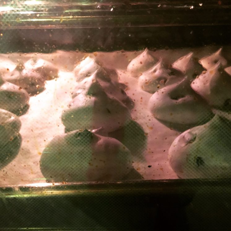
What about the not-so-traditional way? I love to experiment with food, and fairly recently, I came across something called aquafaba. What exactly is aquafaba, you ask? Have you ever bought a can of chickpeas? As a person who occasionally subsists on hummus alone, I can tell you that I go through a ton of them! Well, aquafaba is the liquid in the can that you usually drain and throw away! Little did I know that I should have been saving it! You can actually treat aquafaba just like egg whites – put it in a mixing bowl, whip it with a hand mixer, and you'll soon get beautiful foamy peaks, just like you would with eggs! This version of the recipe is cool because it's also vegan! If you're ever searching for something to make when the crowd has a lot of dietary restrictions, this recipe is perfect, because it's egg-free, dairy free, nut-free, soy free, AND gluten-free.
Does it come out as good as the traditional version? Just take a look at this photograph I took when I first tried out the recipe! Waiting for them to finally come out of the oven is definitely the hardest part...
They were delicious and my family couldn't even tell the difference between these guys and the egg-version!
Here's the recipe I used – these are plain vanilla meringues but you can add all kinds of flavorings! When I made these, I substituted mint extract for vanilla extract and added some vegan chocolate chips, and that's only one possibility! Either version is a healthy, tasty treat that would be a welcome addition to any dessert table!
Now... ready, set, BAKE! (and please tell me I'm not the only one obsessed with the Great British Bake Off!) Let us know if you take a shot at these recipes, or share some of your own healthy holiday tips with us!
Most importantly, have a lovely, family-and-friends-filled holiday season!
Out of This World
A Gallery 6 art exhibition preview
Fanciful Out of This World art exhibition debuts at Children’s Museum of NH’s Gallery 6
This winter, the walls of Gallery 6 at the Children’s Museum of NH will take the magical and fantastic impossibilities of our imaginations and present them in a way that is real and believable. Out of This World, on view December 3, 2015 through March 1, 2016, contains fanciful creatures in playful and whimsical settings and promises to take viewers on journeys to strange worlds.
Out of This World shines a spotlight on Fantasy art and invites the viewer to suspend disbelief just long enough to view a new realm of possibilities, unhindered by our own expectations. “Believing the ‘impossible’ comes very naturally to children, so this Fantasy theme is a perfect fit for an art exhibition within a Children’s Museum,” shared Tess Feltes, Gallery 6 Curator.
Also on view on the exterior of the Museum is an installation by local artist Sam Paolini. “Sam’s art is all about other worldly creatures existing in fantastic and colorful environments, so we wanted to have her art greet guests as a way of saying, ‘Hey, anything is possible here!’” said Exhibits Director Mark Cuddy. The Gallery 6 art exhibitions are supported by Optima Bank and Trust, the NH State Council on the Arts and the Fuller Foundation.
Close to forty works of art have been selected for the Out of This World exhibition, ranging from anthropomorphized forms to detailed illustrations. These paintings, prints and mixed media pieces are mostly available for purchase and a portion of the proceeds goes directly to supporting the programs at the Children’s Museum of New Hampshire.
Featured artists in this show include: Bill Baber, Cori Caputo, Brian Cartier, Victoria Elbroch, Wolfgang Ertl, Tina Fazio, Marina Forbes, Theresa LeBreque, Fleur Palau, Sam Paolini, Sue Pretty, Phillip Singer, Beth Wittenberg and Shi Yue. The public are invited to join the artists at an opening reception, generously sponsored by Optima Bank and Trust, on Thursday, December 3 from 5:30-7pm.
Out of This World can be viewed in Gallery 6 during regular business hours at the Children’s Museum of New Hampshire: Tuesday – Saturday 10am-5pm and Sunday noon-5pm. No admission fee is required to view the gallery only. Regular admission applies for families who wish to also explore the rest of the museum.
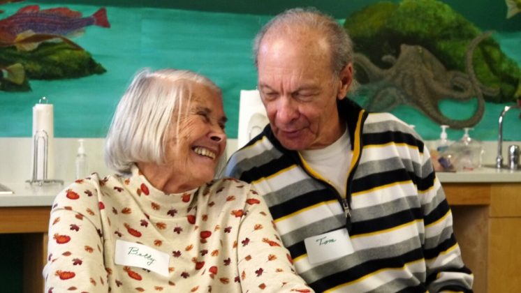
Alzheimer's Cafe: A Look Forward
 CMNH recently celebrated the four-year anniversary of our monthly Alzheimer's Cafe. This lovely program flies a bit under the radar - and may not seem a typical program for a children's museum, but it holds an important place of honor in our mission to be a family resource.
The Café is designed for families caring for a loved one at home with dementia or Alzheimer's. It's a place to spend a couple of hours out together where the focus is not on the disease. We wanted to provide a lively, safe place for people to gather in the company of others who are on a similar journey. It's a place where you can make new friends and leave your troubles at the door: more afternoon tea than therapy session.
After four years, we decided to conduct a study of the benefits of coming to the Café from the prospective of the families who attend. Care partners and people with dementia agreed to fill out surveys, be interviewed and observed at the Café. The head of Nursing at Keene State College and a recent graduate from UNH nursing school helped design the study and collect data. On Monday, November 16 we will sharing our findings at a symposium at Wentworth- Douglass Hospital Conference Center. All are welcome to attend this free event from 1-4pm to hear what we learned.
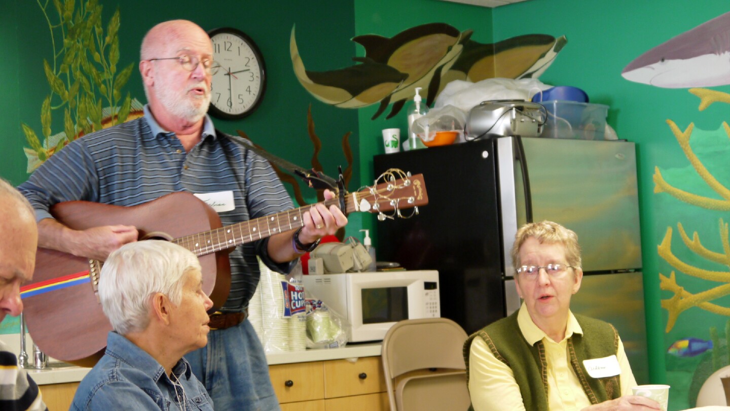
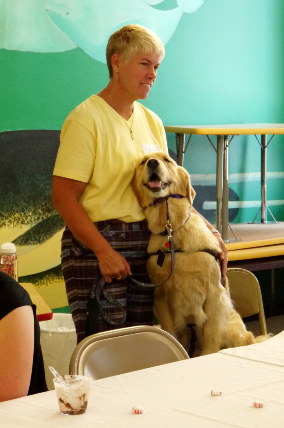
So if you see McGee, a friendly Golden Retriever, walking around on the 3rd Thursday of the month, or hear the sounds of laughing, singing or instrumental music coming from the Museum's Deep Sea classroom, pop in and visit the Alzheimer's Cafe!
Gallery 6: Flight
Artist Interviews
By Taylore Kelly
GORDON CARLISLE
Q. Your work felt very nostalgic and dream like. The collage and acrylic medium really worked well together to form a united story. Does creating your work come easy to you?
A. I've been making collages since about 1973, the same year I graduated from San Francisco Art Institute. Back then, I was interested in converting these collages into etchings. Soon, I became less and less enchanted with the etching process, and wanted the collages to just exist as themselves.
I've always found the act of creating them very liberating. Initially, I try not to get too much in the way of where they seem to want to go. Then I jump in and help them get there. Creating collages on my own, I don't work with themes. But I've found Tess's (Gallery 6 coordinator) imposing of a theme a worthwhile challenge.
Here, she asked for two or three collages from me. However, the way I work, I like to lay out a couple of dozen at once and see where they take me. Then, it's a process of winnowing out the less effective ones in favor of the better. By the way, I'm often asked if these are made digitally. They're not. I still use old school materials like X-acto blades and spray mount adhesive.
Nearly all my collages include the use of acrylic paint to help blend the collaged elements to each other, so that the scenes become a little more seamless.
The nostalgia comes from my love of older published magazine elements. I collect all these in portfolios marked "Men", "Women," "Women with Appliances," "Animals." etc. Born and raised in the 1950's, these are the type of magazine elements I grew up with as Life, Look and The Saturday Evening Post came to the door. There's a beguiling innocence to the way those magazine models have been posed that speaks of another time. I enjoy juxtaposing this innocence with more contemporary situations.
Does it come easy? Sometimes. It's important to know when to stop. Sometimes there's technical difficulty assembling just a simple collage, what with complex cutting and gluing and pre-planning the sequence of events. And to be honest, after all that, some just don't cut it, and have to be shelved. In the end, I hope to have more successes than failures; at least the 2-3 Tess requested of me.
In my best dreams, I do fly, and it feels as natural as can be, my arms outstretched as I whoosh through rooms in the house, downstairs, out the door and over canyons and river valleys.
CORI CAPUTO
Q. Your work really seems to have a playful and dreamlike feeling of calm to it. I, as the viewer wanted to dive in and be a part of what was going on in your pieces. What are you trying to communicate with your art?
A. Because there are a variety of themes in the paintings I have in Flight, I would say their messages range from humor, expressing the simple, sheer joy of weightlessness, adventure, independence, escape, searching for answers or a world-view of a situation. However what I ut on the paper and what the viewer discovers about the art can be two different things depending on their mood when they view the work. It could be deemed as ridiculously silly or it could motivate them to cast off their old life and start fresh. That is the joy of Art, it can be many different things to many people.
TESS FELTES
Q. Each and every one of your pieces truly feels like the subject manner is a living, breathing animal. They are evocative and moving. What is your relationship with animals?
A. As a shy child growing up on a farm in rural Ohio, I can honestly say my first best friends were animals. Countless hours were spent surrounded by nature, observing and forming life-long bonds. I was always drawing in an attempt to capture and respond to the beauty and mystery of the natural world.
It was when I had the opportunity to learn scientific illustration through the Field Museum of Natural History in Chicago that I was finally given the tools to hone my skills and to more accurately portray my subjects.
This has lead to an interesting and gratifying career creating illustrations for journals and books. Lately, however, my goal is to animate my subjects, concentrating on the illusion of movement. It is a privilege to exhibit these attempts at the Children's Museum.
LARRY ELBROCH
Q. What better way to see the world than from a hot air balloon? The imagery looks like layers and layers of other images and seems to tell a story. How has your work influenced your life?
A. I have had several careers, but my photographic work has enriched my life for two reasons. First, traveling to countries like, India, Nepal, Tibet, Myanmar and Bhutan has exposed me to various cultures centered on spirituality. These amazing experiences started my creative journey. Second, meeting these people enhanced my understanding of self. We are more the same than different and we should respect these differences.
BARBARA ALBERT
Q. This group of work really draws one’s eye in, with its metallic movement and beautiful composition. Did you choose the subject matter first as flying saucers and then create these pieces? What is your creative process?
A. The holographic movement of my circle paintings when lighted comes from silver acrylic paint applied thickly and scraped thin with a palette knife. I experimented with different size canvases and a variety of contrasting backgrounds to suggest environments for these reflective circles. Both the seemingly three dimensional round shapes and the flickering motion suggested flying saucers to me and I was delighted to show them in CMNH's Gallery 6 exhibit about Flight.
SUE PRETTY
Q. The combination of weaving and painting is such an innovative and beautiful display. This, united with the subject matter was quite breathtaking. How many different mediums do you work in?
A. The piece in the Flight exhibition, Soaring above the Fractured Landscape is a combination of digital images. The photo was manipulated in Photoshop: two variations of the image with a layer of text against the background. The images were then printed, cut apart and re-woven. I then glued these down and highlighted with gouache. I have 2 separate images: the background and the three trees in the foreground and an eagle, each with variations. I like the fact the reassembled image tends to not always perfectly align. This enhances the fracturing of the landscape concept.
My paper weavings are like sketches. Tapestry is a very slow process, which means I can work through images and thoughts with these. The different media feed each other. I think it is important to experiment to open new avenues of exploration. I have done quite a few paper weavings. I work on multiple drawings and paintings before starting a tapestry.
In general I work in tapestry, digital, multimedia, painting, beads, dying, photographs and sculpture. I have worked in oils, encaustic and quilting. I think it is all part of a whole – creative play.
KATE HIGLEY
Q. The pieces in this show have a lot of energy and seemed to have method of free-rein motion. The imaginary insects have an amazing frenetic energy that resembles real life, this combined with the colors and how the medium was used is quite spirited. Which is more important to you, the subject of your painting, or the way it is executed?
A. The subject of these works was part and parcel of how they were executed. They are actually monotypes, one-of-a-kind prints with the addition of acrylic paint and pastel. I began the print with the teeth several years ago and had it stored in a flat file. Every few months I would take a look at it and wonder what to do next. When the theme of the exhibition was announced, I knew it was time to finish the work. The initial energy was still there and I began to make silly details like the teeth, the feet and colored toenails. When it was completed, I knew I needed a companion. Initially, I began with something quite different, but when it was well started, I knew it was too static. I started over and copied the basic body shape of the first insect but with more vibrant colors. The proboscis was the final bit because I wanted a conversation between these two critters and it certainly seemed that he might not be able to fly with that appendage. So, the subject informs the execution. I love insects and in the past have done some highly realistic drawings of insects while viewing them through a microscope. A field zoology class in graduate school at Wesleyan introduced me to insects and the myriad ways they are assembled. These two pieces are purely imaginative, while knowing that insects often have "hairy" bodies and appendages like a proboscis. They certainly don't have toenails.
SUSAN SCHWAKE
Q. The pieces in Flight seem to almost tell a story. They also remind me of what music would look like if it were painted: a beautiful collaboration of birds, insects and flowers. Who and what are your influences?
A. My three paintings in the exhibit were painted in late winter when my thoughts turn to summer. They came on the heels of a February/March visit to my husband's parent’s home in Germany where spring comes at that time. They live in a tiny village surrounded by farm and woodlands and we do a lot of biking around the woods. My love of everything nature and working with children are my greatest influences. Nature never disappoints me and the freedom children have with art inspires me.
TAYLORE KELLY
Q. Your pieces, as well as the titles, are very poetic and dream-like. Did you create the two pieces specifically around the theme of Flight, and do you name your pieces before or after they¹ve been created?
A. Any gallery exhibition I am asked to be in I always create the work specifically for that individual show. I never use pre-existing work. I feel like I am cheating if I do that and am selling myself and the "soon to be born" work short. There is a lot of art wanting to be born and waiting to be created. That's why I am an artist, so any opportunity I have, I cowgirl up and create. It's an amazing way to be and I am quite fortunate to be attuned and wired this way. It's the same with commissions. I would never give someone something I had already done, I want my work to feel special and the person who has it to know it was specifically made for them, or the show. It feels important and vital to constantly make new art and not just back log and recycle my work and I am lucky and fortunate enough that most of my work is bought and goes to new homes. That's the point.
As for naming of pieces, I wait until I am done with the piece and ask it what it's name is. I sit down quietly with the piece and just start writing the words I see in my mind, after asking, and thus the title. It's really like creating beings for me. I don't know how to do it any other way. It's like giving life and with that comes responsibility and care. When it comes down to it, I just care a lot. I want that to show in everything I do, including my art.
NEVA COLE
Q. The natural world imagery is peppered throughout your work, and is quite eye-catching in its jeweled, vibrant colors and almost musical feel. Like one can "feel" your work, sometimes musically, sometimes with it's breathing….What kind of creative patterns, routines or rituals do you have when creating?
A. I work in a lot of different mediums and each medium seems to have it’s own routines. For the tile/alcohol ink pieces (the butterflies and birds), that series started with a lot of free experimentation with a fun new media. I stumbled upon a reference to alcohol inks online and after purchasing some, just played with it for about a year, off and on. I tried it on glass votives, textured tile, old porcelain plates from Goodwill, and then finally on the bright white bathroom tiles. Initially I wasn’t trying to make any kind of recognizable shapes. I just liked the way the paint interacted with itself. There weren't any patterns, which I love. I like the randomness. But inevitably, after the chaotic randomness is created, whether it’s with the alcohol inks or with the painted paper I use to make my paper collages, I always end up going back to very ordered and precise work to tie it together. For instance, with the tile pieces, I end up taking things a step further and adding and subtracting the ink until I’m left with some kind of animal form, be it butterfly, bird, octopus, etc. With the paper collage, I use a very precise routine involving tracing paper, exacto knives and ink. I actually enjoy using ink on the very edges of the paper to create the illusion that the piece is a painting or drawing, and not a collage of many hundreds of pieces of paper. For me, the combination of chaos or experimentation and precision and detail is really satisfying.
Family Literacy Month Kick-Off
 By Meredith Lamothe
We’re always excited about literacy here at The Children’s Museum of New Hampshire. Sure, we were thrilled that we were going to celebrate Family Literacy Month this November, but really—we focus on literacy all the time!
We recently hosted a well-attended Jumpstart To Read event; we host Books Alive! events several times a year where costumed characters bring favorite stories to life, and we have weekly Baby Storytimes as part of First Friends Playgroup, where we can teach early literacy skills to the caretakers of our youngest visitors. So a whole month dedicated to literacy? It was a no brainer!
What does family literacy month mean at CMNH?
It means that we’ll have literacy tips posted around that you can peruse as you play. We’ll have multiple activities throughout the week that highlight literacy—and how easy it is to promote and explore at home. We’ve also made up some great handouts, have several guest speakers planned, and will have weekly crafts and games in our Muse Studio—all related to literacy!
We also have our museum. Our museum is a literacy gold mine! Literacy goes so far beyond reading books. Yes, that’s an important part—but literacy, specifically family literacy, is so easy to incorporate into your daily life—or your museum visit!
When you’re playing with your kids in the submarine—make it a story. Does that story have a beginning, middle and end? DING DING DING! LITERACY ALERT! Choose a favorite color when you walk in the museum and then as you play, find that color in each of the exhibits! DING DING DING! Visit the Muse Studio and have your child explain to you the steps they’re taking in making a craft or playing with the magnet table! DING DING DING!
Any conversation, any question, any exploration can easily be made into a rewarding literacy experience. If you have questions, we’re happy to help.
We’re always excited about literacy!
About the Author: Lead Educator Meredith Lamothe has always been a book nerd, library lover and fan of acting out and telling silly stories. She has a blast hosting the Museum’s weekly First Friends Playgroup and has her Master’s Degree in Library and Information Science with a focus in Children’s Programming from Simmons College.
Pizza - A Cautionary Tale
by Marty Kelley
Pizza is dangerous.
I don’t think I’m telling you anything you don’t know here. We, as a people, have been warned since infancy about the myriad dangers of pizza. The warnings are a part of our collective knowledge. Don’t swim for an hour after eating. Don’t play with fire. Look both ways before you cross the street. Stay away from pizza. We know this.
And yet now, I find myself in the unenviable and dangerous position of being a judge at a pizza competition called Pizzafest. They might as well have called it DeathFest!
How can I be expected to survive an ordeal like this? We all know the dangers: hot cheese can jump off the top of a pizza and drop, like molten lava from a volcano, onto your lap. I will wear an asbestos apron, naturally, just like we all do when eating pizza.
What of the cheese that does not fall into your lap, but rather clings to the roof of your mouth searing and scalding your delicate palate until it seethes with angry blisters. I will make sure to dunk the pizza in ice water for at least 45 minutes, as we were all taught to do at our mother’s knee.
The toppings, though? What if a rogue pepperoni slides down my throat the wrong way? There are just so many things that could possibly go wrong. That’s why I’m judging this contest. I’m doing it for you. I’m doing it to protect you. If I judge this contest and eat this pizza, it will keep you safe.
And that’s what I want to do.
You’re welcome.
Marty Kelley, children's book author and illustrator, will be one of three judges at this year's PizzaFest Fundraiser and Online Auction. This is an all-you-can-eat (at your own risk) pizza-tasting fundraiser and all proceeds go to benefit the Children's Museum.